Posts

Showing posts with the label simplified

Download Bega Font Family From Indian Type Foundry

Image
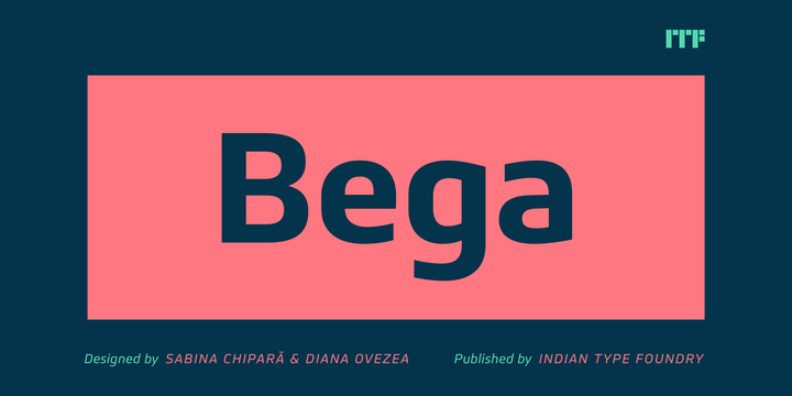
Download Bega Font Family From Indian Type Foundry Bega is a simplified sans serif typeface. Formal reduction plays a strong role in its design. This is most visible in its ‘spurlessness.’ The visible strokes (or spurs) have been eliminated from the letterforms that would typically feature them. The lack of spurs in Bega is most-clearly visible when you look at the top-left corners of letters like ‘m’, ‘n’, and ‘r’. The Bega family includes eight weights, which range from Thin through Black. Each weight has two fonts on offer: An upright font, and an italic. Bega’s italics are obliques; their letterforms are slanted. The strokes of Bega’s letterforms all appear to be monolinear; that doesn’t mean that Bega is without contrast, however. Thanks to the family’s large number of weights – eight really is a lot – you can combine two or more of them with each other to create headlines that exhibit quite a bit of contrast! Each of

Download Ekster Font Family From Indian Type Foundry

Image
Download Ekster Font Family From Indian Type Foundry Ekster is a geometric sans serif typeface from the Parisian designer Ilya Naumoff. Many of its letters are simplified; you’ll find several places in the typeface where the connection of bowls to stems isn’t fussy, for example, and horizontal strokes – like those in the ‘f’ and the ’t’ along the x-height – don’t bisect their letters’ main vertical stems (but populate the left-hand side only instead). Ekster’s lowercase ‘u’ is also symmetrical. The family includes a staggering number of weights – eight in total, and these range from Thin through Black. Each weight has both an upright font and an oblique-style italic on offer. The letterforms in all of the Ekster weights are drawn with virtually monolinear strokes. Ekster’s x-height is moderate, and the lowercase’s ascenders rise up to the same height as the capital letters and the numerals. However, the best feature of Eks